The Brief
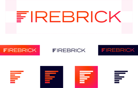
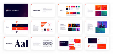
For more than two decades, Firebrick Consulting has positioned some of the technology industry’s most exciting brands and products from its headquarters in Silicon Valley. Having previously partnered with April Six on successful Client initiatives, Firebrick invited our North America team to refresh its overall design and storytelling. The company was seeking to more closely realign its brand elements (logo, visual treatments, website, photography) to its world-class methodology.
What Does a World-Class Brand Look Like?
Before our team could begin crafting this new look, we took a deep dive into Firebrick’s existing branding—and that of its competitors—to identify components to improve, remove, and stand apart from.
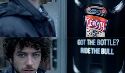
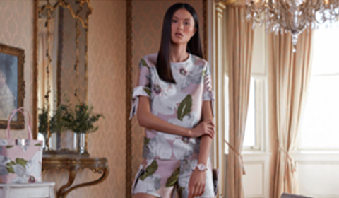
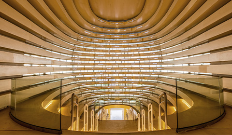
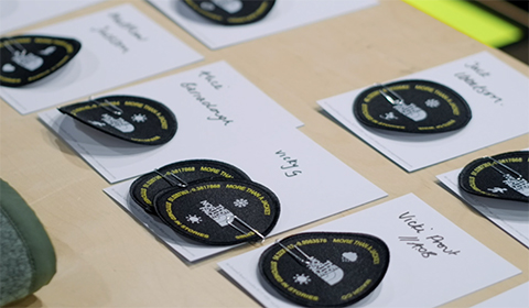
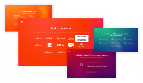
We developed and shared seven unique branding concepts (examples above), including preliminary logo explorations, mood boards, and creative examples. These creative directions were inspired by different insights and facets of Firebrick’s business, each of which informed what a world-class brand could look like.
The Solution
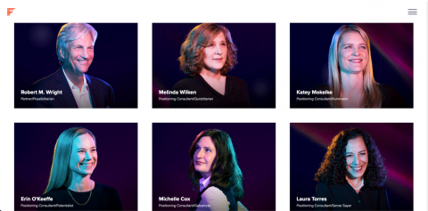
“There’s greatness within nearly every tech business—and Firebrick is focused on unleashing it.“ Leverging that core insight, the April Six team built a design logic that feels both modern and sophisticated. In messaging and imagery, the refreshed brand speaks to the deep-down aspirations of CEOs and other senior decision-makers for growth and, yes, greatness. The brand has been intentionally humanized, its differentiated positioning feeding everything from tone-of-voice to look & feel.
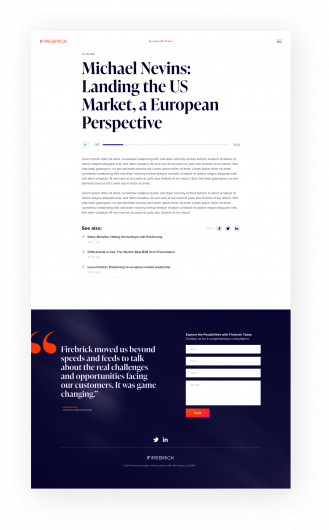
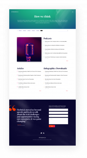
The refreshed brand and website advances Firebrick to a premium, sophisticated territory that speaks more assuredly to the modern aspirations of tech leaders.
“We are over the moon with excitement for our new brand from April6. Jill and team deeply listened to our needs and desires for the rebrand, and were collaborative and inspired at every step of the project.
Our new website elevates the way we communicate our business so clearly, existing and new clients alike, have been remarking on how powerfully it reflects our firm.”
Briana Schweizer, Creative Director, Firebrick


